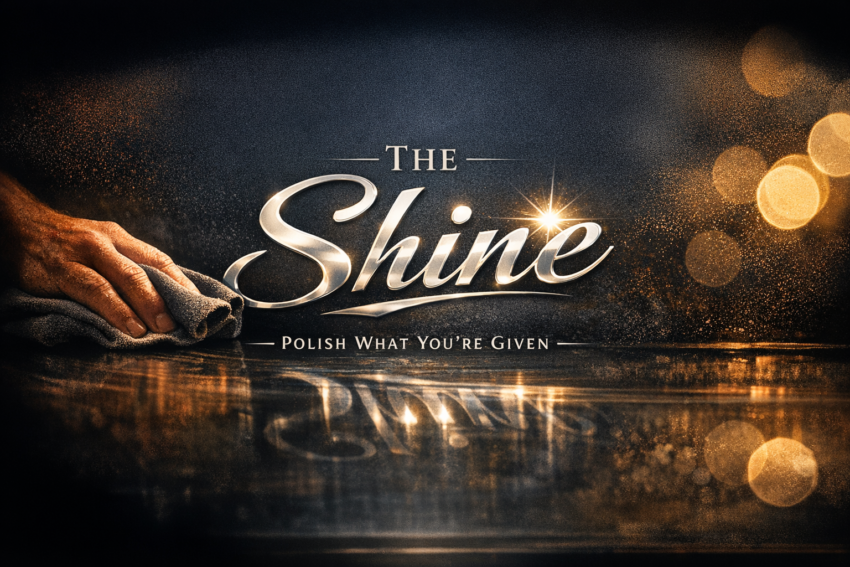
Bands and businesses alike, I kept my lane to branding, marketing, and PR. The art or the business — I stay clear. I only polish what I’m given. How they reflect the shine, that’s on the client.
When I stepped into the performing‑arts preschool and its sister music academy, nothing was broken. It was just tired. The energy was stale, the materials were dated, and the presentation didn’t match the work happening inside the buildings. My job wasn’t to fix the culture or reinvent the mission. My job was simple: tighten the visuals, clarify the message, and give the place a look that made people take it seriously again.
The preschool had grown fast, from a handful of kids to a full roster with a waiting list. A second school was added in New York City, but the branding hadn’t kept up. Daily ballet, tap, piano, drama, Spanish, science… it was a strong program wrapped in weak presentation. The academy had been around since the early 90s, but the brand felt like it had been left in the early 90s too. Good bones, tired skin.
I didn’t touch the curriculum. I didn’t touch the teaching. I didn’t touch the business model. I stayed in my lane. I took what they handed me — logos, flyers, recital sheets, open house posters — and polished them until they reflected better than they arrived.
The first thing I did was clean up the identity. Not reinvent it — just tighten it. The preschool already had a concept: imagination and intellect under one roof. I helped steer it toward a clearer expression of that idea. A modern look, a cleaner logo, a tagline that actually said what they did. Nothing fancy. Just honest.
The academy needed a different touch. It had history, but no dignity left in the presentation. I brought back the original crest, cleaned it up, and gave it a little class. Gold, black, white — simple, traditional, grounded. “Est. 1992” wasn’t nostalgia. It was a reminder that the place had roots worth respecting. I didn’t tell anyone to act differently. I just raised the floor visually, and the culture rose to meet it.
Events were the easiest place to make an impact. Before I arrived, everything looked like copier‑folded handouts. I turned recitals into magazine spreads. I turned open houses into community events. I turned summer theatre into something families talked about instead of something they tolerated. A kid with balloons on a brochure. A museum venue for a recital. Clean typography. Real layout. Nothing loud — just intentional.
I slipped advocacy into the margins. Autism Awareness butterflies hidden in the design. A breast cancer ribbon folded into a curtain graphic. Inclusive silhouettes — dancers, musicians, a kid in a wheelchair — all treated with the same dignity. Nobody noticed, and that was the point. Advocacy doesn’t need a spotlight to matter.
I kept everything modular. Flyers, banners, avatars, social posts — all speaking the same language. The preschool, the academy, the summer programs, the open houses… all tied together without forcing it. Just clean, consistent, steady.
The first big event I touched used the academy’s original logo. I added a live remote radio broadcast and tied in a local charity. Not to make noise — to make meaning. A tired brand suddenly had a pulse again. A parade float with live performers — drums, bass, guitar — rolling through town under a clear sky. Kids playing real music in real time. A school showing what it actually did instead of telling people what it hoped to be.
I didn’t change the art. I didn’t change the business. I didn’t change the people.
I just polished what I was given. How they reflected the shine — that was on them.